Psychology 240 Lectures
Chapter 2
Statistics 1
Illinois State University
J. Cooper Cutting
Fall 1998, Section 04
Your textbook:
- Gravetter, F. J., Wallnau, L. B. (1996). Statistics for the Behavioral Sciences:
A First Course for Students of Psychology and Education, 4th Edition. New York: West Publishing.
Chapter 2 - Frequency Distributions
Give several of the students a pair of dice. Have them roll the dice and report the results. Do this three times (enough times to get a good sized sample). As they report the results, write the numbers on the board. (Collect the dice now rather than later)
- notice that we have a lot of data, but it isn't very organized.
One way to organize it is to create a frequency distribution table
1) A frequency distribution is an organized tabulation of the number of individuals located in each category on the scale of measurement.
what is the range of responses (highest and lowest numbers)? fill in the X column
how many of each did we get? - fill in the f column - this is the frequency of occurrence
Notice that if you add up the frequecy column, you get the total number of observations
S f = N
___________________________
  X	f	p	%
  12
   :
   :
  2
___________________________
If you wanted to know what the total of all of the X's was, how would you do it? The easiest way would be to multiply the (X) & (f) columns and then add (sum) the results.
S (Xf )
Some additional information.
Proportions. How much of the total group got this value for X? How do you
get this information?
p = f / N Recall that N = the total number of observations.
Percentages. What percent of the group got this value for X? How do you get this?
p * 100
- Note: Grouped frequency distribution tables. Often ranges or categories, rather than specific values, are used for X. Think of a grading scale, (A = 90-100, B = 80-89, ...). Can set up frequency distributions for these too.
Your book gives a nice set of "rules" for constructing "nice" categories. These are rules of thumbs, not hard and fast obligatory rules.
2) We can also summarize the data with pictures, well graphs really.
For a histogram, vertical bars are drawn above each score so that 1) the height of the bar corresponds to the frequency, & 2) The width of the bar extends to the real limits of the score. A histogram is used when the data are measured on an interval or a ratio scale.
- Note (from Chpt 1)
For a continuous variable, each score actually corresponds to an interval on the scale. The boundaries that separate these intervals are called real limits. The real limit separating two adjacent scores is located exactly halfway between the scores.
Each score has two real limits, one at the top of its interval called the upper real limit, and one at the bottom of its interval called the lower real limit.
- Note that the upper real limit of one interval is also the lower real limit of the next higher interval.
- make a histogram of the dice results
horizontal bar - the X axis - the abscissa - the values of X
vertical bar - the Y axis - the ordinate - the frequency values
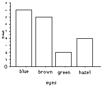
For a bar graph, a vertical bar is drawn above each score (or category) so that 1) The height of the bar corresponds to the frequency, & 2) there is a space separating each bar from the next. A bar graph is used when the data are measured on a nominal or an ordinal scale.
- make a histogram up for eye color for the class
In a frequency distribution polygon (or a line graph) a single dot is drawn above each score so that
1) The dot is centered above the score
2) The height of the dot corresponds to the frequency. A continuous line is then drawn connecting these dots. The graph is completed by drawing a line down to the X-axis (zero frequency) at each end of the range of scores.
There are 3 characteristics used that completely describe a distribution: shape, central tendency, and variability. We'll be talking about central tendency (roughly, the center of the distribution) and variability (how broad is the distribution) in future chapters.
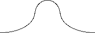
Shape: In a symmetrical distribution, it is possible to draw a vertical line through the middle so that one side of the distribution is an exact mirror image of the other.
In a skewed distribution, the scores tend to pile up toward one end of the scale and taper off gradually at the other end.
The section where the scores taper off towards one end of a distribution is called the tail of the distribution.
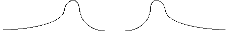
| <------ tail points: negatively skewed | | positively skewed: tail points this way ----> |
A skewed distribution with the tail on the right-hand side is said to be positively skewed (because the tail points towards positive numbers). If the tail points to the left, then the distribution is said to be negatively skewed.
Stem and leaf displays - These displays break each number down into a lef part called the stem and a right part called the leaf. If numbers are two digits, then the left digit is the stem and the right digit is the leaf. -get a picture and can recover all of the individual data points
e.g., section 04 stem and leaf of weight
 9  |  0
10  |
11  |  028
12  |  0
13  |  00
14  |  00055
15  |  0
16  |
17  |  56
18  |  5
19  |
20  |  55
21  |
22  |  05
23  |
24  |  0
3) So far we've talked about describing an entire set of observations, but we can also use freqeuncy distributions to describe the position of individual within the set.
___________________________________________
  X	f	 p	%	cf	c%
  5	2	.05	5	40	100
  4	10	.25	25	38	95
  3	16	.40	40	28	70
  2	8	.20	20	12	30
  1	4	.10	10	4	10
cf = cumulative frequency
c% = cumulative percentage
Determining your percentiles
Note: with continuous data, we must consider the upper real and lower real limits
So suppose you got a 4 on the quiz, what percent rank do you fall into?
1) find the number of individuals who are located at or below each point in the distribution. So look at the cumulative frequency.
- So for a score of 4, the cumulative frequency is 38, meaning 38 of the 40 students got a 4 or worse on the quiz.
2) convert these numbers into cumulative percentages
- So for a score of 4, the cumulative percentage is 95%.
But, remember that these scores are not points on a scale, but rather intervals. So a score of 4, really means that that person got somewhere between 3.5 and 4.5. The cumulative percentages are associated with the upper real limits of the interval. So the 95 percentile is at 4.5 NOT 4.0. So remember to use the upper real limits.
Interpolation - sometimes the value that you're interested in are not on the table. So you have to make an educated guess. One way to do this is to use interpolation.
you know that at 8:00 the temp is 60
and at 12:00 the temp is 68
question: what is the temp at 9:00?
1) find the width of the interval on both scales
- e.g., time and temperature 8 to 12:00 & 60 to 68 degrees
4 hrs 8 degrees
2) find the position of the intermediate value in the interval
= distance from the top of the interval / interval width
= 12 - 8:00 = 3 hrs --> 3 hr / 4 hours = .75
3) use this position (fraction) to determine the distance from the top of the interval
from the other scale
distance = (fraction) X (width of other scale)
distance = .75 X 8 degrees =6 degrees
So need to change the amount by 2 degrees --> 68 - 6 = 62 degrees at 9:00
Another example: see book Example 2.6
___________________________
__ X  	f	cf	c%
  10	2	25	100
   9	8	23	92
   8	4	15	60
   7	6	11	44
   6	4	5	20
   5	1	1	4_
what is the percentile rank corresponding to X = 7.0?
1) find the endpoints (real limits) of the interval
7.5 44% and 6.5 20%
2) find the width of the interval on both scales
- 1.0 and 24%
3) find the position of the intermediate value in the interval
= distance from the top of the interval / interval width
= 7.5 - 7.0 = .5 .5 / 1.0 = .5
4) use this position (fraction) to determine the distance from the top of the interval from the other scale
distance = (fraction) X (width of other scale)
= .5 X 24% = 12%
so subtract 12% from 44% and you get 32%
**** Go thru the different examples in the book. Test yourself ****
Go to Chapter 1: Introduction to Statistics
Go to Chapter 3: Central Tendency
Return to Psych 240 syllabus page
Return to Psych 345 syllabus page
Return to Statistics Lectures page
Return to Illinois State University Home Page
Return to Illinois State University Psychology Home Page
If you have any questions, please feel free to contact me at
cutting@main.psy.ilstu.edu.